

Wellbeing Catalog
Simplifying access to wellbeing resources through a unified hub where members can easily explore, learn, and take control of their health journey.
⏱︎ Read time: 2 minutes

Overview
Wellbeing Catalog was created to bring all wellbeing resources together in one place, solving the challenge of scattered content across the platform.
By uniting all media, health journeys, habit tracking, and other tools into one connected space, it empowers members to discover relevant content, explore new topics, and take meaningful steps toward better health.
Details
My role:
Product Designer
Timeline:
Dec 2024 - June 2025 (beta launched)
Responsibilities:
End-to-end process
Highlights
The Wellbeing Catalog introduces a scalable framework for wellbeing content,
enabling new topics and programs to be added seamlessly.
100%
tested users rated easy to browse & use

More metrics and outcomes to be released after public launch.
CHAPTER 1 - DISCOVERY
Business Objectives
01
Personify aims to improve population health outcomes by helping members take meaningful action on their wellbeing. But fragmented experiences across the platform made it hard to show how our tools truly drive healthier behaviors.
02
Wellbeing Catalog was created to unify all wellbeing resources in one place to
help members discover relevant programs, use rewards effectively, and take guided actions that matter. It also supports our larger goal of building personalized journeys that increase engagement and retention.
Problem & Context
Fragmented experiences made wellbeing content hard to find.


For a member like Fiona, who is eager to improve her wellbeing feels overwhelmed by the volume and scattered nature of resources, making it hard to know where to start or pick up where she left off. Even with motivation, the lack of structure and clarity often leads her to disengage.

For a member like George, who isn’t actively seeking wellbeing support, the overwhelming amount of content and lack of clear guidance when he first explores the platform makes him feel alienated and unlikely to return. The experience feels too complex and irrelevant, leading to immediate disengagement.
Competitive Analysis
All leading health platforms provide centralized access to wellness content, streamlining discovery and encouraging repeat engagement.


Every competitor offers a clearly organized hub for health-related resources, making it easy for users to browse, revisit, and build habits around trusted content. While discoverability is strong across the board, few platforms personalize the experience based on user goals or health history—leaving room for deeper relevance and retention.
CHAPTER 2 - DEFINE
Turning insights into Action
We’ve heard the frustration—too many resources, too overwhelming. Here are our key findings to help guide us into ideation.
01
Simplify access
Members need an easier way to find wellbeing resources without having to dig through multiple disconnected areas.
02
Improve visibility
Wellbeing offerings are often hidden or overlooked, highlighting the need for clearer pathways across the platform.
03
One Catalog
A centralized location to unify all wellbeing experiences, making it easier for members to explore, engage, and return.
Success Criteria
In close collaboration with stakeholders, we aligned on clear, objective-level KPIs and success criteria to guide the project forward.
Reduce identified health risks
We aim to support members in taking meaningful actions that lead to measurable improvements in their health risk profiles.
Client satisfaction
Delivering a seamless, valuable experience that meets client expectations and strengthens trust in our wellbeing offering.
Engagement of new users
Encouraging first-time users to explore, connect, and return by creating an inviting and intuitive entry point.
Keep engaged users engaged
Sustaining momentum for active users through personalized, relevant experiences that evolve with their wellbeing journey.
CHAPTER 3 - IDEATION
Turning Insights into Flows
Outlined core features and journeys, partnering with stakeholders
to ensure feasibility and user alignment.

Mind Mapping
Ideating the Key Architecture

User Journey
Visualizing the Ideal User Flow
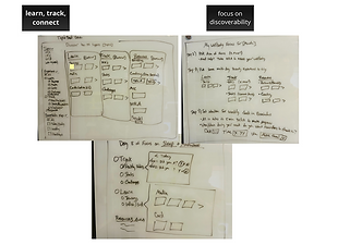
Early Sketches
Laying out The Foundation
CHAPTER 4 - DESIGN
1st Iteration
I took a mobile-first approach to ensure the experience feels intuitive, accessible, and seamless for users who primarily engage with health content on their phones.

In this first iteration, I focused on giving users a way to browse all of our product offerings while still allowing them to focus on one topic at a time. I incorporated horizontal scrolls (commonly used in popular apps) as an effective pattern for discovery without overwhelming the user. This layout also creates space to surface related programs users may find valuable.
2nd Iteration
For the second iteration, I spent some time to refine designs with input from leadership and engineering, focusing on feasibility and priorities.

I refined the home page by narrowing it down to core topics, cutting back on selection overload, and using more visuals to make the experience feel inviting. I changed the "Learn, track, and resources" to be within the discover tab of each topic to reduce clicks and keep everything accessible on one screen. While stakeholders responded positively to the “My Progress” section and embedded discovery, engineering flagged it as technically heavy and potentially out of scope for now.
3rd Iteration
For the third iteration, I implemented deeper changes based on feedback from product leadership and engineering—refining the concept to better align with feasibility and technical constraints.

I leaned into more visuals on the main catalog page to make the experience feel richer and more engaging. I also pivoted from iteration two’s split between main topics and subtopics, combining them into a single view to reduce extra clicks and create a smoother flow. As a team, we aligned on moving forward with the "Learn, Track, and Resources" tabs as they support scalability and set us up well for future feature expansions.
4th Iteration
For the fourth and final iteration, I focused on accessibility, design system alignment, and applying best practices by aligning with all teams.

I moved away from using horizontal scrolls with headers and subtext due to accessibility concerns, readability was inconsistent, and varying text lengths created unpredictable layout heights. Engineers also flagged the use of images for every topic as a scope risk, so I aimed for a balanced solution that felt visually engaging while keeping accessibility front and center.
The topic guide structure remained consistent from the previous iteration, but we removed images entirely based on feedback from the content team. Since content is frequently updated, maintaining visuals would be unsustainable. We also renamed the “Resources” tab to “Connect” to better reflect the nature of the content within. Around this time, the design systems team finalized the content card components, allowing us to align with system standards and ensure consistency across the experience.
CHAPTER 5 - USABILITY TESTING
Conducting User Testing
I collaborated with our research team to conduct user testing to validate our design solutions.
We conducted user testing with 10 participants to evaluate clarity around the Learn, Track, and Connect tabs, as well as overall usability of the Catalog UI. Participants were asked to locate the Mental Wellbeing topic and explore its content to assess ease of navigation. Our goal was to understand how intuitively users could engage with the platform’s core structure and flow.
Positive Findings
100%
of users agree the Catalog is easy to use and aligns with user expectations.
100%
of users were able to find mental wellbeing resources when tasked.
Areas to Improve
User attempted to locate a specific topic but was unable to find it within the Catalog, indicating a gap in content coverage or discoverability.
Users preferred reading content over following daily journeys or watching videos, but the catalog lacked article-based resources to support that need.
CHAPTER 6 - LAUNCH
Introducing Wellbeing Catalog
Beta Launched (2025)

Reach out to me if you'd like to see web version.
Retrospective
Lessons
Designing a large-scale initiative like this taught me that product development is deeply collaborative. Every team marketing, content, product leadership, engineering, research, and design, plays a critical role in shaping the experience. There’s no single “perfect” solution; instead, we work in an agile, iterative environment where feedback loops drive continuous improvement. What we ship is often an MVP, and success depends on our ability to evolve the product over time based on real user needs and team input.
One of the biggest tradeoffs I faced was balancing visual richness with technical feasibility. While high-quality imagery can elevate the user experience, it posed scalability challenges for both content and engineering teams, especially with frequent updates. I had to make thoughtful design decisions that preserved aesthetic appeal while prioritizing functionality, accessibility, and long-term maintainability. Ultimately, I focused on creating a flexible system that meets user needs without overburdening internal teams.